Signed in as:
filler@godaddy.com
Signed in as:
filler@godaddy.com

The packaging will have a modern, clean bright look like the fruits it was made with, complimented with quirky line work within the background, making the use of hand drawn text to give a more unique outstanding look.
Taking advantage of being locally owned, healthy, traditional Italian manufacturing to outplay industrial ice-cream manufacturers.
we wish to help Giana Fabbro achieve her goals of selling Gelato after having gone to Gelato university

A mixed box design was designed also for a general tasting for the customers.

Dieline layout

Mockup
This design showcases a raspberry base, with a swirl at the top to really entice the customer into purchasing the flavor.

Dieline layout

Mockup
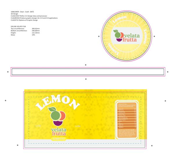
This design has a simple lemon base, showcasing the outter lemon sides, with the inside lemon, simple and to the point

Dieline layout

Mockup
One of the more complex designs, showcasing an apple crumble with a side of cream, the top of the design is the inside color of the apples.

Dieline layout

Mockup
Similar to the previous lemon design, the watermelon has the outside of the watermelon and the inside of the melon as the top.

Dieline layout

Mockup
For the kiwi flavored one, I opted to have only the inside shown as the brown colors experimented with just felt off puttin.

Dieline layout

Mockup
The design has the outside of the blood orange topped with the inside of the orange.
We use cookies to analyze website traffic and optimize your website experience. By accepting our use of cookies, your data will be aggregated with all other user data.